Mixing outdoor furniture colors is one of those design moves that looks effortless when it works and vaguely chaotic when it doesn’t. You’ve seen both. A patio where the sage green chairs, cream side table, and terracotta cushions feel like a magazine spread. And another where the mismatched pieces look like leftovers from three different sales. The difference isn’t luck or budget – it’s a small set of pairing rules that turn a random collection into a composed outdoor room. This guide walks you through how to combine grays, whites, and accent shades on your patio so every piece looks like it was meant to be there.
Start With a Two-Color Backbone Before You Add Anything Else
The single most useful habit in mixing outdoor furniture colors is deciding on a backbone before you shop for accents. A backbone is two neutral shades that will dominate roughly 70-80% of the visible furniture surface. Everything else – throw pillows, planters, umbrellas, a single accent chair – orbits around that pair.
Choose your backbone from these reliable outdoor pairings: driftwood gray with white, charcoal with light gray, weathered teak tone with cream, or black with slate gray. Notice each combination is a light neutral paired with a darker neutral from the same undertone family. Warm with warm (cream and teak), cool with cool (charcoal and slate). That undertone match is what keeps the pairing from feeling like two random paint chips stuck together.
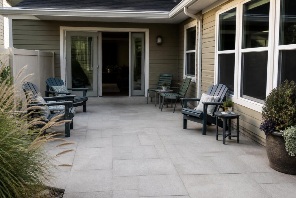
Once your backbone is set, apply it to the largest pieces first: dining chairs, a sofa or seating group, and larger tables. If you’re building around Adirondacks, for example, four chairs in white with two darker end tables reads intentional. Four chairs in four different colors reads like a rental. This doesn’t mean everything has to match perfectly – it means the eye needs an anchor. Give it one, and you can layer freely from there without the patio ever feeling scattered.
Use the 60-30-10 Rule the Way Interior Designers Do
Interior designers lean on a color ratio that translates beautifully to patios: 60% dominant color, 30% secondary color, 10% accent. Outdoors, the “60” is usually your main seating and the deck or patio surface itself. The “30” is a supporting neutral – side tables, an umbrella base, planters, a rug. The “10” is where color earns its keep: cushions, a single painted chair, a bold umbrella canopy, or flowering plants.
Here’s why this ratio matters when you’re combining shades. Most patios fail because the accent color is doing 40% of the work instead of 10%. Six coral cushions on six chairs, a coral umbrella, and a coral planter isn’t accent – it’s saturation. The eye has nowhere to rest. Pull three of those coral pieces out, replace with white or natural woven textures, and suddenly the remaining coral pops the way it was supposed to.
Apply the ratio like this on a typical seating group:
- 60% – four to six chairs in your dominant neutral (white, gray, or driftwood)
- 30% – tables, umbrella pole, planters, and rug in your secondary neutral
- 10% – two accent cushions, one accent plant color, or one single painted chair
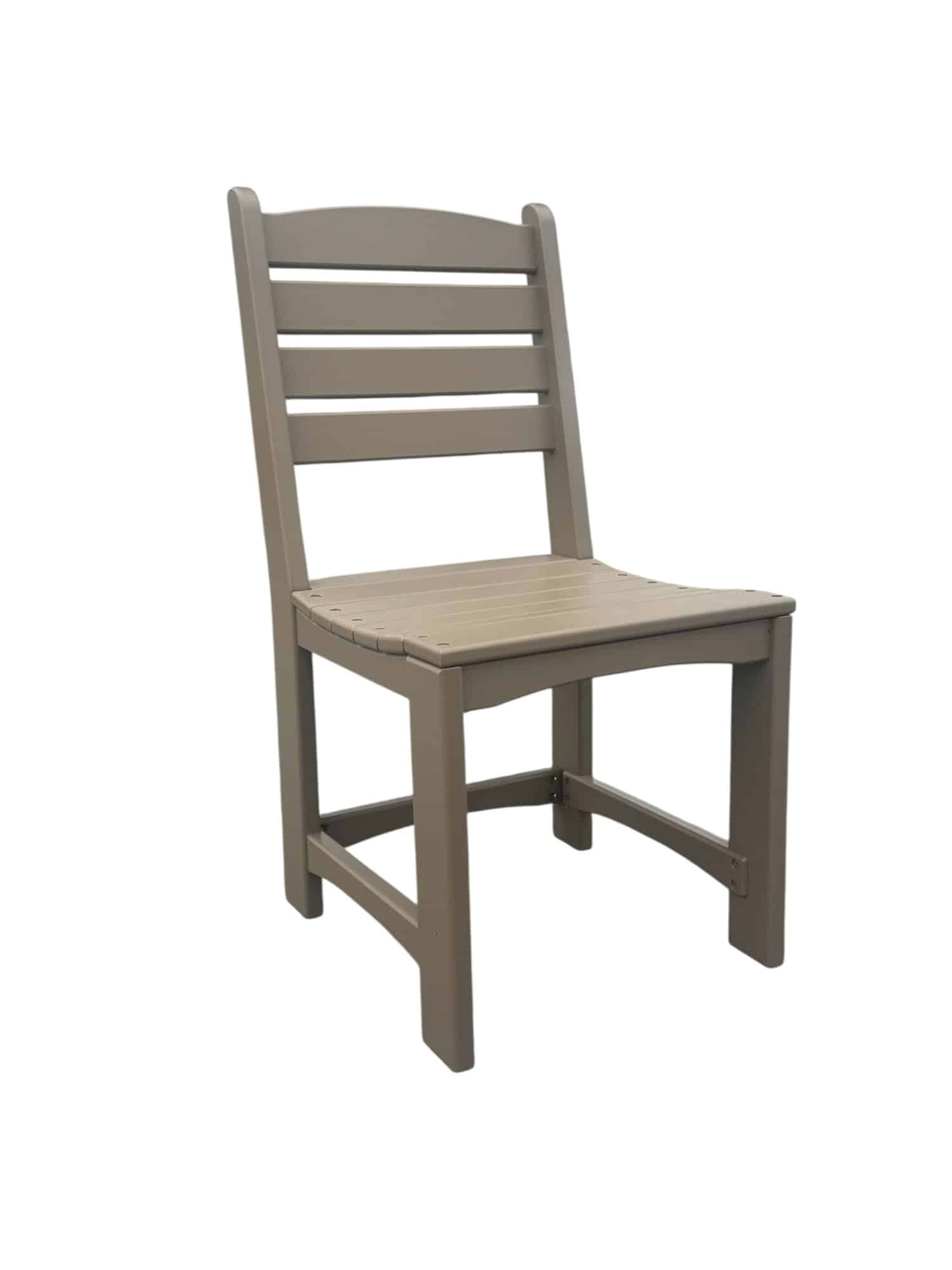
If you’re planning a dining area, an armless café chair lineup in a single neutral gives you that 60% foundation, freeing you to be playful with table linens and centerpieces without the space feeling busy.
Understand Undertones Before You Commit to a Color
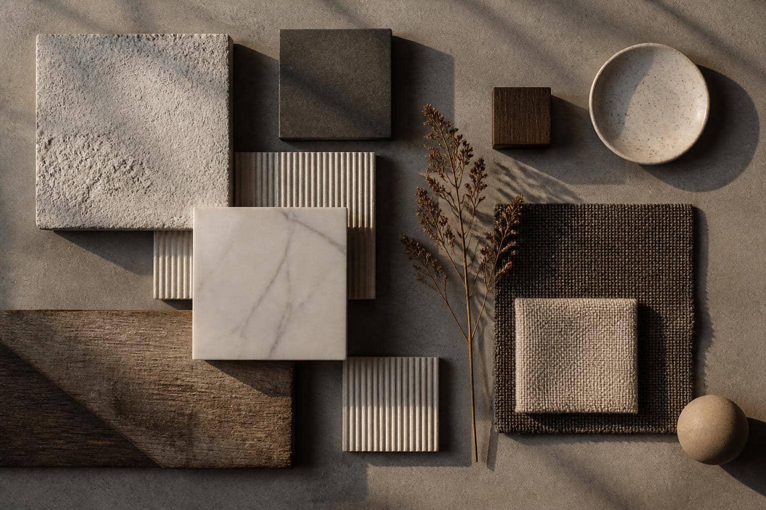
Undertones are the reason two “white” chairs can clash on the same patio. One white might have a cool blue undertone; another might lean warm and yellow. Sit them next to each other in daylight and the mismatch is obvious even though both are technically white.
Outdoor plastic and poly furniture generally falls into three undertone families:
Cool Undertones
True white, bright white, slate gray, charcoal, and black with blue-black tones. These read crisp, modern, and pair well with stainless accents, bluestone patios, and cool green plantings like blue fescue or juniper.
Warm Undertones
Cream, ivory, sand, weathered teak, driftwood, and warm grays with beige in them. These pair naturally with wood decks, terracotta pots, brass fixtures, and warm plantings like ornamental grasses, lavender, and roses.
Neutral (True) Grays
Some grays are genuinely balanced and bridge both worlds. These are the most forgiving pieces to buy first, especially if you’re not sure whether your patio reads warm or cool. A neutral gray table can sit between a warm-white chair and a cool-slate umbrella without drawing attention to the mismatch.
To identify your patio’s dominant undertone, look at the fixed elements you can’t change: the house siding, the deck or paver color, and the roof or pergola. If those elements are warm, buy warm-undertone furniture. Fighting the fixed palette almost never works.
Pick One Accent Color and Repeat It at Least Three Times
An accent color that appears once looks accidental. An accent color that appears three times looks planned. This “rule of three” is the fastest way to make a mixed-color patio feel curated instead of random.
Say you love a deep botanical green. Instead of buying one green chair and calling it done, place green in three locations: two green cushions on opposite ends of a seating group, a green ceramic planter near the entry, and green foliage plants that echo the shade. Now the eye travels between those three points and reads the palette as intentional. Do the same with terracotta, navy, mustard, or blush – whatever accent you choose.
Three practical ways to repeat an accent without overdoing it:
- Textiles + hardware + botanical. A cushion, an umbrella tie, and a flower color.
- Two furniture pieces + one plant grouping. A painted end table and a single accent chair, echoed by matching blooms.
- Serveware + lighting + textile. Colored glasses on the table, lantern glass, and a runner.
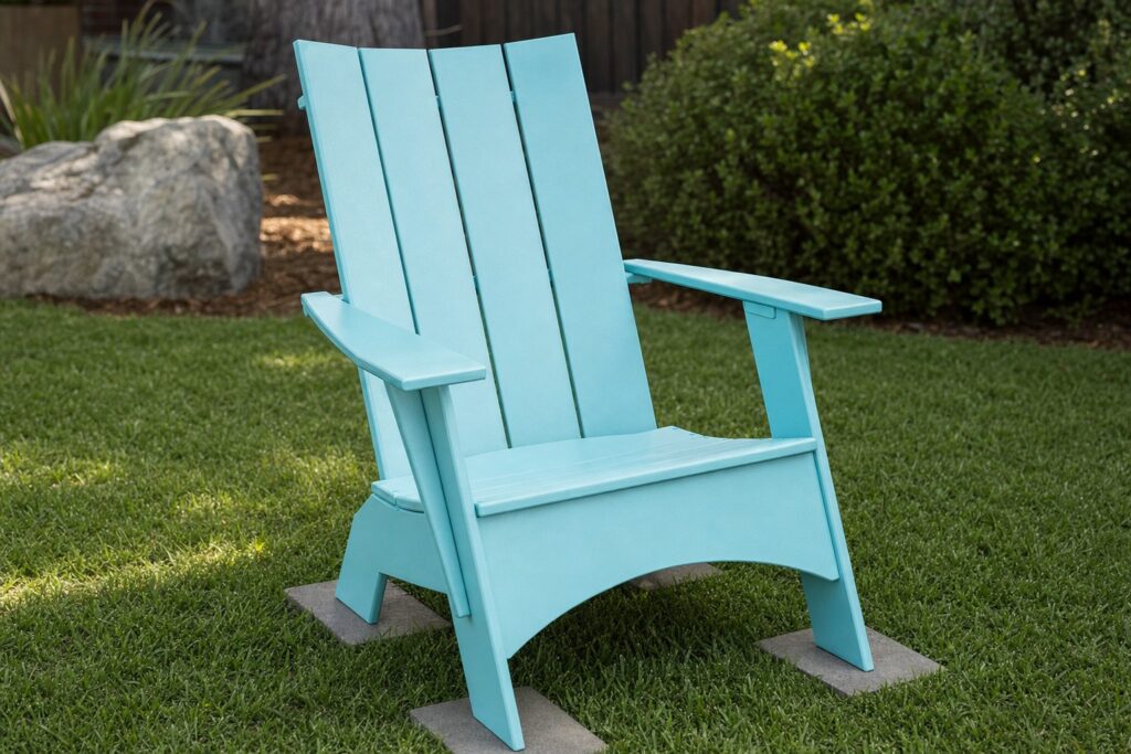
The Hampton Adirondack Chair comes in several colors, which makes the “one bold accent chair among neutrals” approach easy to execute. Five chairs in white with one in a saturated color, echoed by cushions and planters in that same tone, is a classic move that consistently photographs well and lives well.
Coordinate With Your Fixed Elements, Not Against Them
The furniture you buy shares the stage with things you can’t easily change: siding color, roof shingles, deck boards, patio pavers, and mature landscaping. Ignoring those permanent elements is the single biggest reason patios end up looking off. A cool slate-gray dining set on a warm redwood deck under a beige stucco wall will always feel like it’s arguing with the house.
Walk your outdoor space with a notebook and write down the actual colors of six fixed elements: siding, trim, roof, deck or patio floor, any permanent structures like pergolas or fencing, and the dominant foliage. Look for the color that repeats. That repeating tone is your patio’s real neutral, whether you chose it or not.
Your furniture should either echo that tone or provide deliberate contrast to it. Echoing is safer: cream siding, cream chairs. Contrast is punchier but requires commitment: white siding, deep charcoal chairs. What almost never works is a middling shade that’s close to your fixed elements but not quite matching – that “almost” reads as a mistake even when it isn’t.
Weather and sun exposure also shift how colors read. Full-sun patios wash out lighter shades and can make bright whites feel harsh at midday. Shaded patios do the opposite – darker colors that looked rich in the sun catalog can feel heavy in a covered pergola. The U.S. National Weather Service publishes UV index data by region at weather.gov, which is worth glancing at if you’re deciding between a light and dark palette for a very sunny yard – darker plastics simply run warmer to the touch in direct high-UV exposure.
Build a Palette That Grows With You Over Time
Patios evolve. You add a chair, replace a cushion, plant a new bed. A good color plan anticipates that growth instead of pretending you’ll never change anything.
The strategy is simple: keep your backbone locked, let your accents rotate. Your neutral chairs, tables, and stools should be pieces you’ll happily own for many years – which is why the structural quality and fade resistance of outdoor plastic matter. When you’re evaluating any outdoor furniture for a long-term backbone role, look for solid warranty terms on both structure and color fade. At Plastic Furniture To Go, that coverage is a 7-year structural warranty and a 5-year fade warranty, which is the kind of protection that lets you commit to a neutral without worrying it’ll look chalky in three summers.
With the backbone locked in, treat accents as seasonal or annual refreshes:
- Spring: soft pastels, fresh green cushions, tulip planters
- Summer: bolder saturated shades – coral, navy, marigold
- Fall: rust, mustard, deep burgundy, dried grasses
- Winter: evergreen boughs, deep forest green, warm white lanterns
Rotating pillows and planters costs a fraction of buying new furniture and keeps your patio feeling current without a full overhaul. If you build the neutral foundation right the first time, you can play with accent color for years without ever regretting a large purchase.
Frequently Asked Questions
How many colors should I use on one patio?
Stick to three color families total: two neutrals for the backbone and one accent for punch. You can add subtle variation within each family – say, cream and driftwood as your two neutrals – but resist adding a fourth color family. Most patios that feel chaotic have five or more competing colors. Three families, applied in a rough 60-30-10 ratio, gives you enough variety to feel layered without crossing into visual noise.
Can I mix gray and beige outdoor furniture together?
Yes, but only if you pick the right undertones. A warm gray with beige undertones (sometimes called “greige”) pairs beautifully with true beige or cream. A cool blue-gray fights beige and looks unresolved. Hold samples or product photos next to each other in daylight before committing. If the gray looks slightly purple or blue next to the beige, choose a different gray. If it looks softly related, you’ve found a working pair.
What accent colors work with white outdoor furniture?
White is the most flexible backbone because it works with nearly any accent. Botanical green, navy, black, terracotta, blush, and mustard all pair cleanly with white. The trick is choosing accents that suit your fixed elements – navy with a coastal house, terracotta with warm stucco, botanical green with a wooded lot. Avoid using more than one saturated accent at a time; white plus two competing bright colors starts to feel like a beach ball.
Should all my outdoor tables and chairs match?
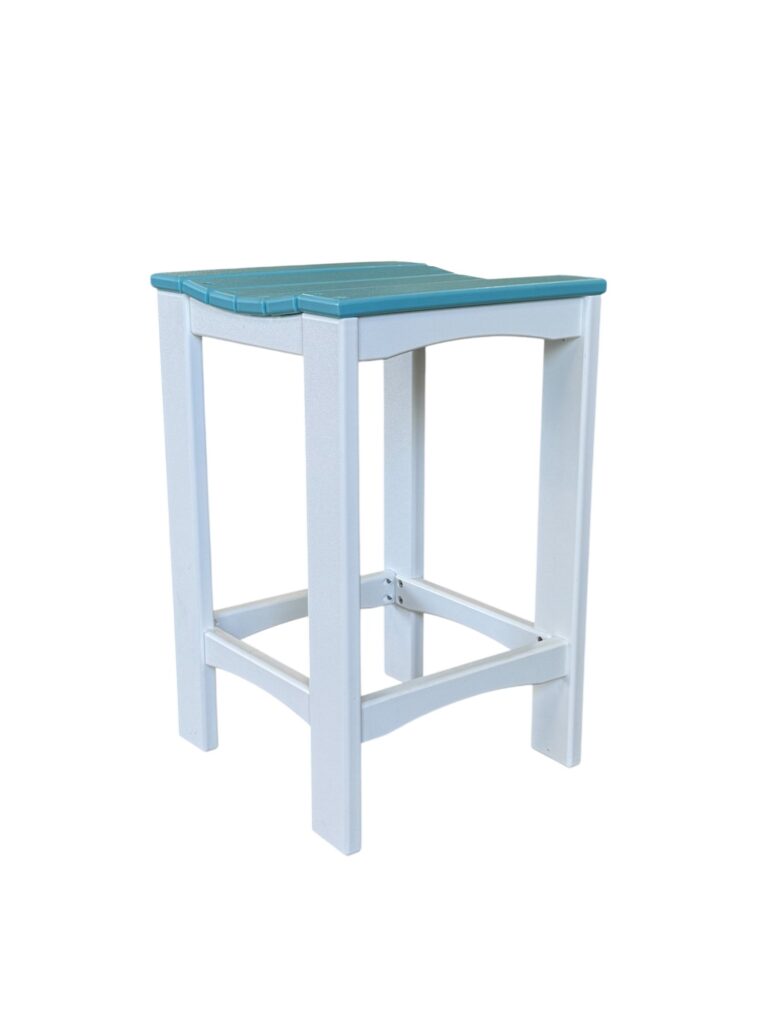
They don’t have to match, but they should relate. Chairs in one color and tables in a coordinating second color often looks more sophisticated than a fully matched set. What you want to avoid is three or four different furniture colors on the same patio with no repetition. A safe formula: chairs in color A, tables in color B, and one repeat of color A or B somewhere else in the space (a bench, a stool, a planter) to tie the whole scene together.
A separate side table can carry your second furniture color. View the Hampton Square End Table options alongside your seating choice.
Building a patio palette you actually love is mostly about restraint – a backbone you commit to, an accent you repeat, and undertones that respect the fixed elements you already own. If you’re ready to lock in that neutral foundation, Plastic Furniture To Go offers American-made, factory-direct chairs, stools, and tables with free nationwide shipping, so you can build the backbone once and rotate accents for years. Browse the full lineup on the Hampton Adirondack or café chair pages, and reach out through the contact form if you’d like a second opinion on pairing colors for your space.